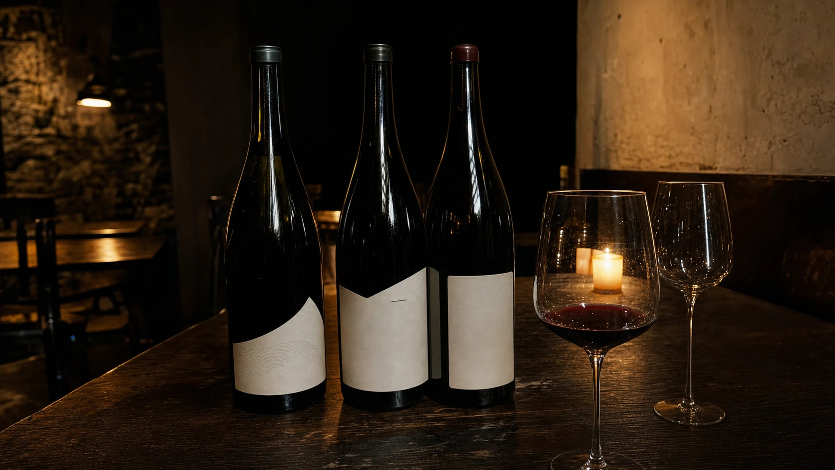
La serie completa
Malpais Tinto
Teide Blanco
Pico Dulce
Teide Blanco
Pico Dulce
Bodeguita Canaria
Tenerife · Vino · Gastronomía Canaria
High-contrast modern serif. Its hairlines and sharp serifs carry serious wine label tradition without quoting it. One family handles every typographic role — wine names, section titles, editorial paragraphs. No bold, no italic. Size alone tells you where to look.
Every fact — DO, grape variety, altitude, alcohol, vintage — set in Plex Mono. The contrast between Gloock and Mono is the contrast between the wine and the winemaker's notebook: one carries sensory weight, one carries precision. Nothing else enters the system.
Gloock at 84px — IBM Plex Mono at 12px · complete label hierarchy in practice
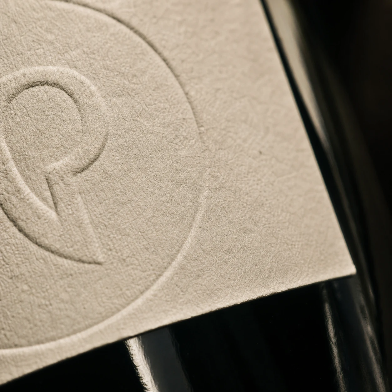
Gloock is a high-contrast modern serif whose ink traps and sharp serifs belong to the tradition of serious wine label typography — without quoting it. It is controlled, not decorative. Its hairlines carry the cold precision of basalt; its strokes carry the weight of volcanic earth. Paired with IBM Plex Mono for all technical metadata, the combination reads as winemaker's field notebook meets considered editorial: one face carries emotion, one carries facts. The pairing is differentiated by kind, not weight — there is no bold, no italic, no ornamentation. Only the size tells you where to look.
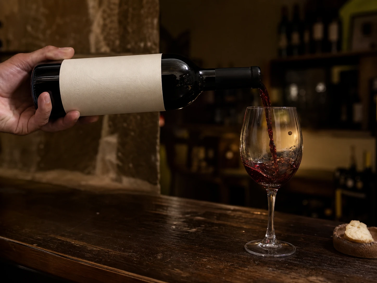
Two surfaces carry everything. Obsidian and Parchment are the architecture — every label, every cover, every page is one or the other. Lapilli, Lava, and Pinar enter only where the terrain demands. The island's character is not Mediterranean warmth — it is pressure, sediment, and time.
Canarian wine has a problem that no amount of marketing has solved: the world's reference points for volcanic-terroir wine are Etna, Santorini, and the Azores — not Tenerife. The island that built the Old World's wine trade on Malmsey has spent two centuries invisible. Bodeguita Canaria sits at the moment just before the correction arrives. The strategic move is to position the house as the sober, unhurried voice — not selling island warmth or heritage nostalgia, but treating Canarian wine the way Frank Cornelissen treats his Etna reds: with geological seriousness, minimal intervention, and a label that says nothing decorative and everything necessary.
The system is built around the tension we named Caldera Hush — the violent geological origin of the island underneath the patient silence of serious winemaking. Obsidian grounds everything. Parchment carries the wine. Lava appears once per label at the moment the eye can feel. Gloock's high contrast makes the wine name the only typography that matters; IBM Plex Mono handles the facts with the precision of a laboratory notebook. Three labels, three grapes, three altitudes — one system that holds without variation or decoration, because the terroir is already the story.