Hotel Rural
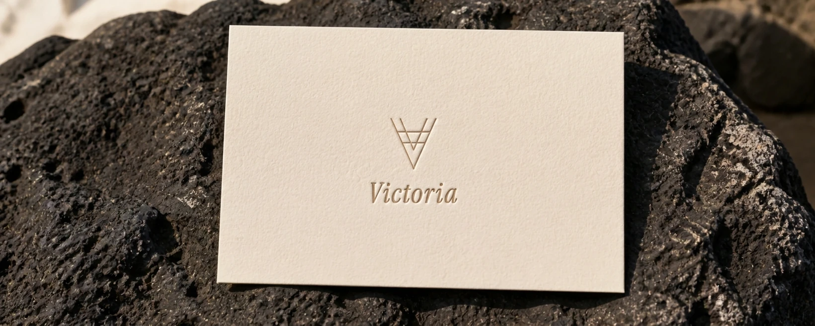
Victoria
28°24′N · 16°31′O · 400 m
Viva Grafix · Brand Identity · MMXXVI
Hotel Rural Victoria sits in one of the most architecturally significant towns in the Canary Islands — a place where three centuries of colonial timber balconies overhang streets paved in volcanic stone, where the valley descends from the summit of Teide to the Atlantic in a single, unbroken breath. The existing identity treats this as scenery. The strategic decision is to make it the substance of the brand itself.
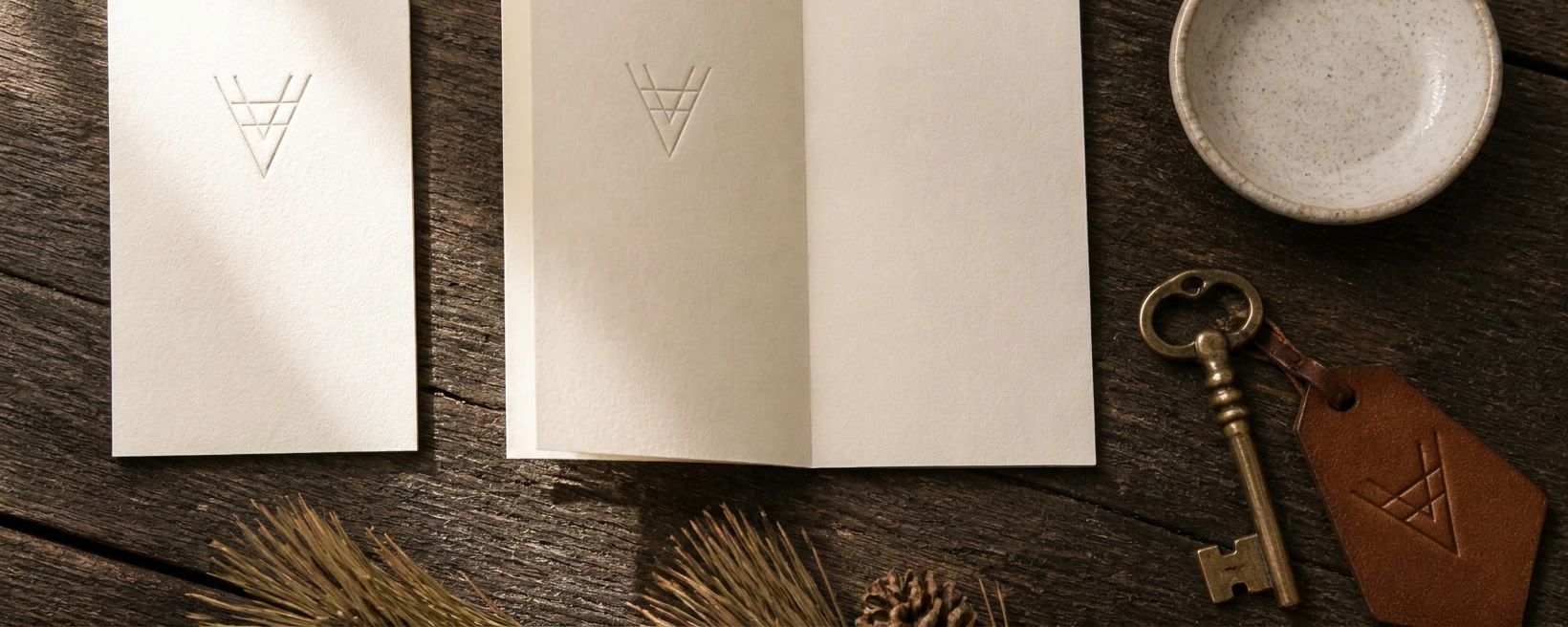
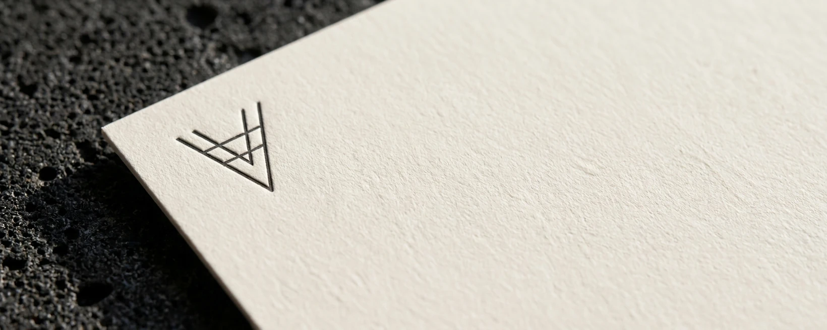
The rebrand performs subtraction before it performs addition. Basalt for weight — the stone the town is literally built from. Driftwood for warmth — the bleached timber that defines the skyline of every colonial-era street. An old-style serif that reads like the confidence of print, not the aspiration of a spa menu. A monogram whose geometry is drawn from the lattice fretwork of the balconies visible from the guest's own window. The brand does not illustrate La Orotava. It is made from it.