Plate Nº 01

Propuesta de identidad

Pastelería

Díaz

La Laguna · Tenerife · Fundada en los años setenta

Obrador propio Identity proposal · Viva Grafix · MMXXVI
Plate Nº 02

Sistema tipográfico

Díaz

Gloock Italic — la misma gravedad en el letrero de escaparate que en el sello de tres milímetros

Dulces de obrador — Selección

Bienmesabe de almendra Almendra tierna · miel de palma · limón natural
3,80 €
Tarta de queso majorero Queso curado de Fuerteventura · base sablé
4,20 €
Truchas de batata Masa hojaldrada · batata · anís · ralladura
2,60 €
Almendrados de gofio Gofio tostado · almendra marcona · flor de sal
1,90 €
Pionono lagunero Bizcocho enrollado · crema pastelera · canela
2,40 €

Display · Wordmark · Carta · Marca

Pastelería

Díaz

An old-style roman with the authority of engraved type. Serifs firm at signage scale, refined at caption size. Its italic carries calligraphic memory without becoming decorative — equally at home on a 3mm foil stamp and a 150px menu board, indifferent to the surface it inhabits.

Body · Precio · Ingredientes

Elaboración artesanal

300 weight for passages; 500 at 8px on ingredient labels. A sans that knows its position — legible at the sizes hierarchy assigns it, absent from the ones it doesn't own.

Both faces have a prior life outside this brief. A typeface invented for a client looks finished on day one and dated in three years. These two are already old enough to know their place.

Plate Nº 03

Paleta de color

Un fondo. Una marca.
Tres en reserva.

Cartón · tejido · envoltorio · caja

Crema #F3ECE1 · oklch(95% 0.014 78) The page before any mark is made. Uncoated board, tissue, the envelope that arrives before the box — two-thirds of every surface the brand owns.
Mora #6B2832 · oklch(35% 0.1 12) A berry that grows against black volcanic soil on Atlantic hillsides. Dark without being funereal — warm without needing light to prove it. The mora tissue inside the box is the colour of Sunday mornings in La Laguna: private, unhurried, already familiar before you open the lid.
Mantequilla #C8A76A · oklch(78% 0.08 82) What the counter reads first when light catches the lid. Heat-pressed metal leaf on uncoated stock — the hinge moment between presentation and lifting, the colour of warmth before it is named.
Piedra #7B6F63 · oklch(50% 0.018 58) The grey of unglazed ceramic, a counter worn smooth by fifty years of the same hands. Where the display case ends and the receipt begins — utility that still carries warmth, the colour of the annotation that accountability requires.
Chocolate #251610 · oklch(16% 0.03 48) Ground and case. The dark the pastry sits against.
Plate Nº 04
Pastelería Díaz branded box resting on a marble counter in morning light, La Laguna

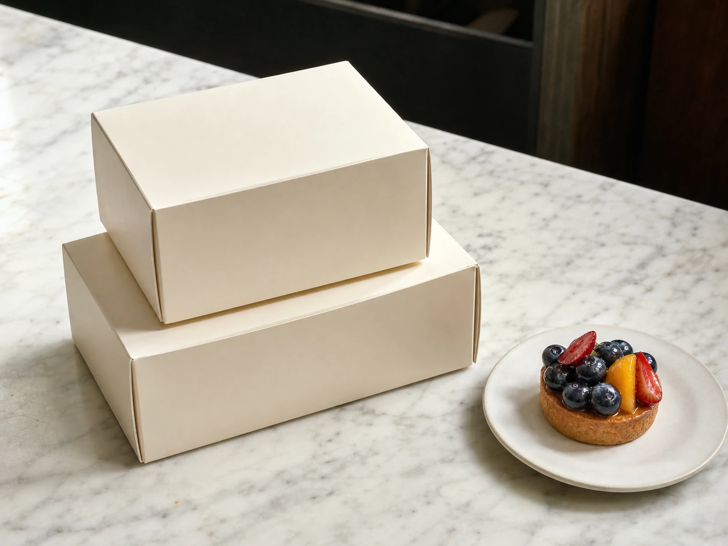
Caja de obrador · aplicación principal

La caja que nadie
tira a la basura.

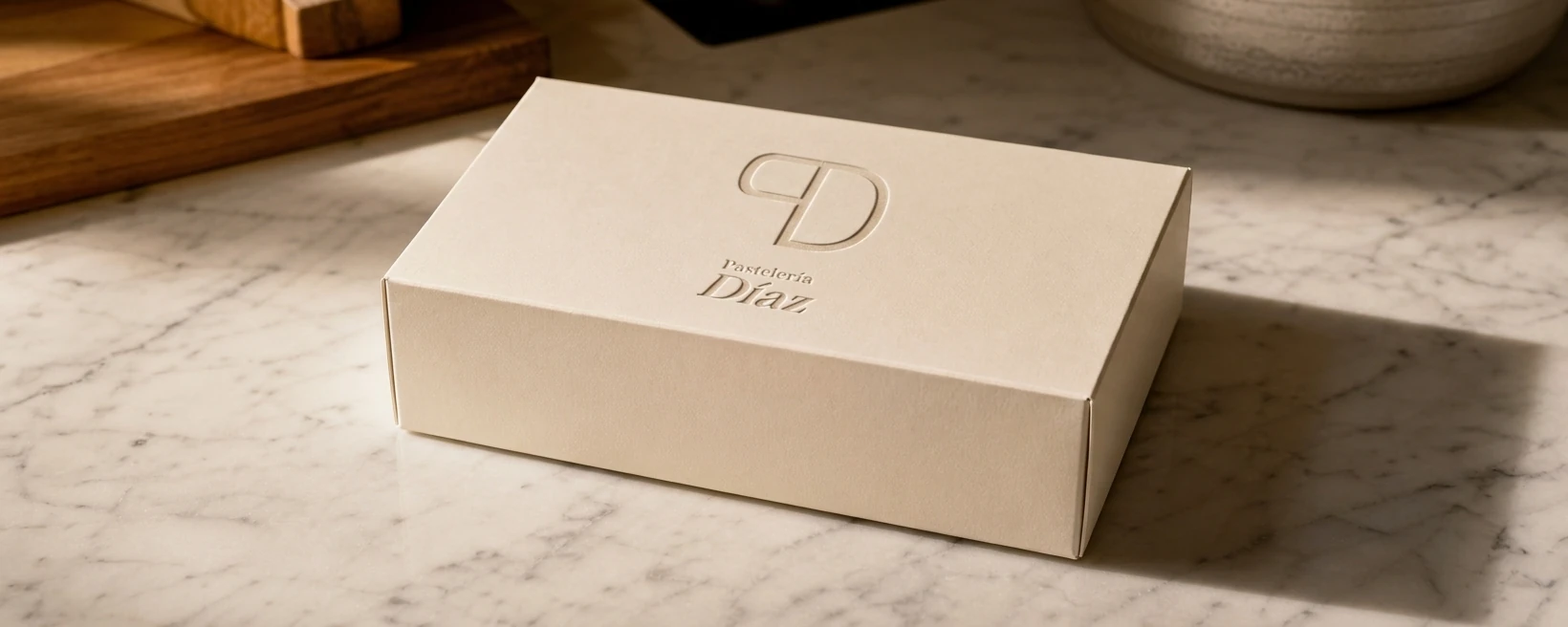
The takeaway box crosses town every weekend — a gift, a Sunday ritual, a small ceremony at the door. Every detail earns its place: the weight of the board, the resistance of the lid, the dark whisper of mora tissue inside.

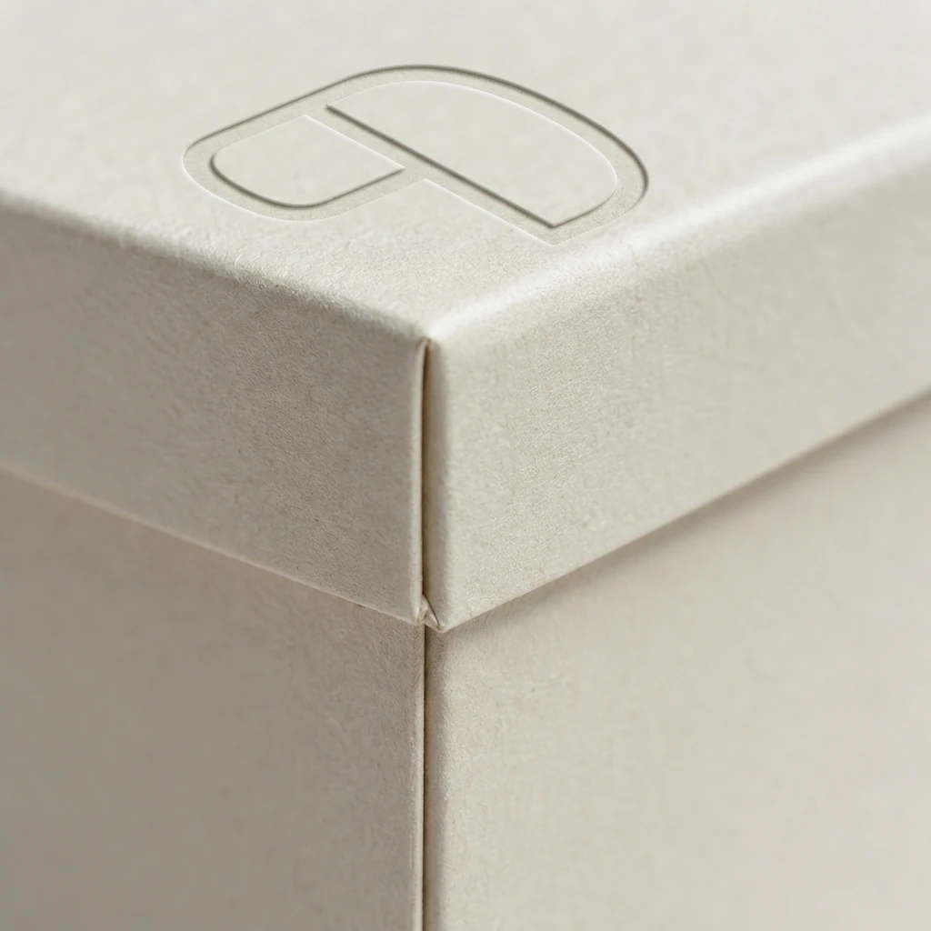
Blind-debossed PD monogram on uncoated cream board. Wordmark in chocolate ink. Mora tissue lining. The paper itself is the finish.

Especificaciones de producción

Stock Uncoated cream board · 350 gsm
Tapa Blind-debossed PD · centrado
Lateral Chocolate letterpress · una tinta
Interior Mora tissue · sin adhesivo
Formatos Individual · 4 piezas · 8 piezas
Plate Nº 05
Detalle extremo: monograma PD en relieve ciego sobre cartón crema sin recubrir, esquina de la caja Detalle · Plate Nº 05·A Monograma PD en relieve ciego · canto de la tapa · fibra de algodón a 2× corte
Cartón: Fedrigoni Arcoprint Milk 350 gsm
Cajas Pastelería Díaz apiladas en el mostrador de piedra volcánica, luz natural de mañana, La Laguna En contexto · Plate Nº 05·B Recogida de mañana · La Laguna
Cartón crema sobre piedra volcánica · luz natural
Plate Nº 06
Argumentario estratégico · Viva Grafix · MMXXVI

Cincuenta años de confianza local genuina. El trabajo del diseño es hacerla legible — no actuarla.

Pastelería Díaz's authority isn't in its age alone — it's in the unbroken chain: obrador to counter to box to table. The visual system reflects that chain. One old-style serif with the weight of engraved type. One uncoated stock. One accent colour pulled from the deep berry tones of the most treasured Canarian pastries. La Laguna is a UNESCO destination; the discerning Canarian and the visiting mainlander both arrive with calibrated expectations. This identity meets them without explanation.

No script type. No illustrative decoration. No artisan signifiers. The work is to remove everything that could belong to any pâtisserie, and leave only what is specific to Díaz. What remains should feel more right in five years than it does today.

Obrador a mostrador.
Mostrador a caja.
Caja a mesa.
La cadena es la identidad.

Proposed by Viva Grafix · La Laguna, Tenerife MMXXVI