
Guachinche · La Laguna, Tenerife
Casa Pedro
Los Toneles
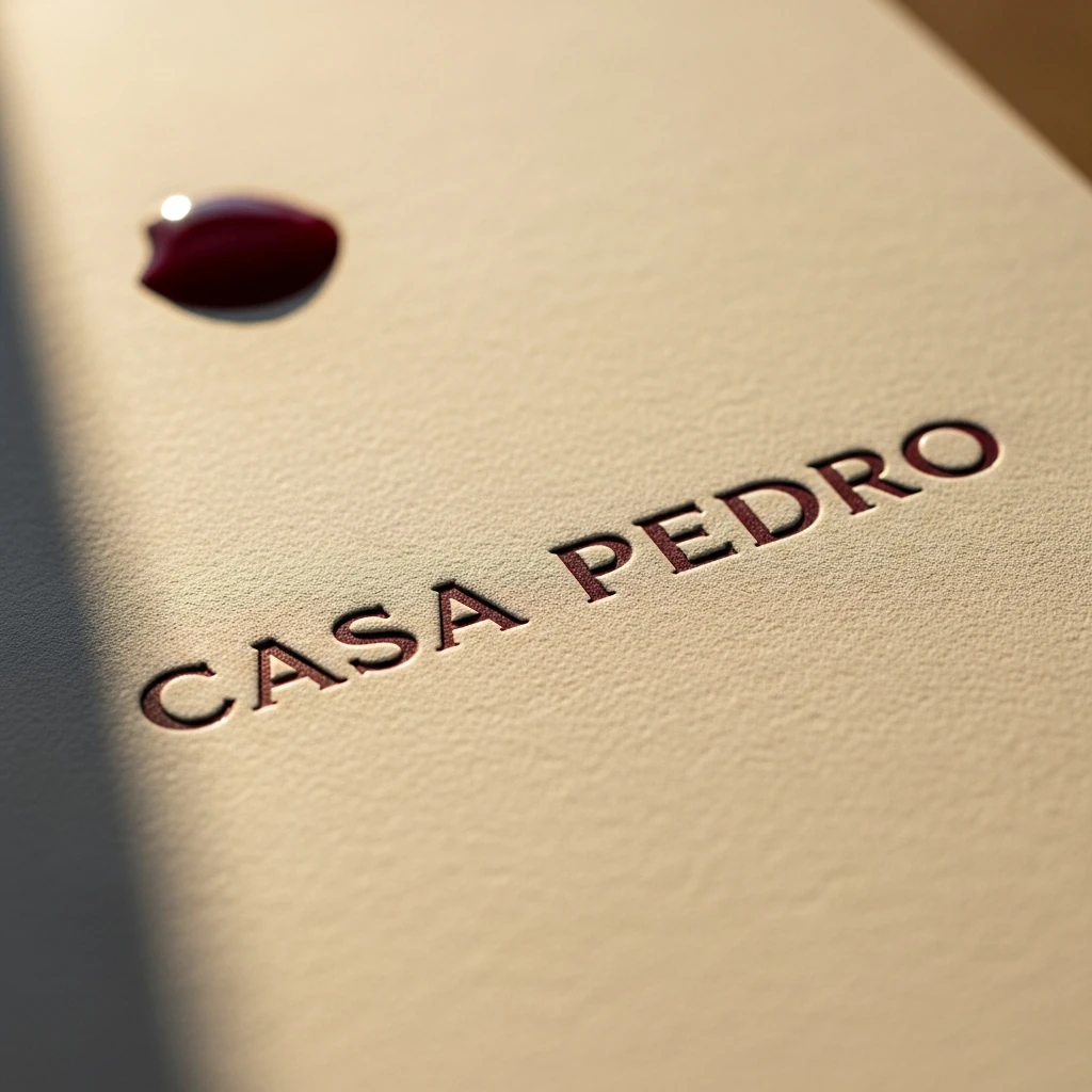
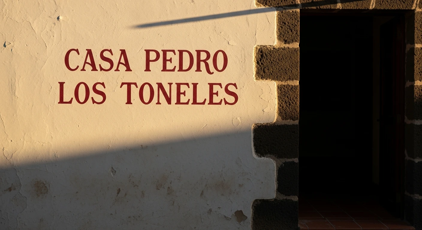
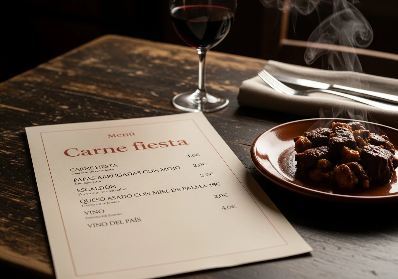
Casa Pedro's hand-scrawled signage already signals authenticity — but only to those who know it's there. The rebrand keeps the warmth and gives it street presence. Instrument Serif's old-book proportions read like hand-painted lettering on plastered stone without faux distress; its italic is the brand's primary voice, unhurried and specific to this place. The five-colour system draws from the volcanic landscape: terracotta earth, dark wine, basalt grey, warm bread-crumb white, laurel-forest green. The CP mark is deliberately spare — a few confident strokes that work chalked on a blackboard, debossed into a menu cover, or scaled to a stone wall at three metres. Permanent enough for a family name. Humble enough for a kitchen that still cooks everything from scratch.